Other Studio Pages:
2004 (Aug-Dec) | 2005 (Jan-May) | 2005 (May-Aug| 2005 (Aug-Dec) | 2006 (Jan-Apr) | 2006 (May-Dec) |
2007 (Jan-Aug) | 2007 (Aug-Dec) | 2008 | 2009 | 2010 | 2011-2012 | 2013 | 2014-16 | 2017 | 2018 | 2019 | 2020
2007
8/17
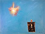
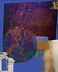
Icarus is finished! The composition, wobbly rectangle, oil washes--all differ from recent pieces.
The dark rectangle envisioned, became turp washes. I had to scrape off the top layer of the pink tendril in the lower right of the rectangle, in order get it to barely appear. This is an important aspect, a kind of key to the piece.
8/20
While painting over the unsatisfying face in Outlook and sketching myself in, I've possibly stumbled onto a new idea. The white paint used to paint out the previous face was still tacky as I started to do the face in charcoal, so the image got "dirtied up" a bit from the errant charcoal dust. After it dried, I hand-scumbled some shading, using the charcoal already on the image. Noticing it began to appear strange, piercing, and looking two ways, I've stopped; and may leave it thus "unfinished." Doing that would still fit into the feel of the piece, although I had different thoughts earlier. The face has some of the look of the black leopard I put in several previous pieces.
8/29
That explains it.
8/31
Three recent art experiences:
Although the sun was up behind me, the moon, about a fist high off the horizon, was a faint reminder of cosmic tugs and eons. The wind, northerly and cool for August, had raised a surf, whose variety was sometimes subtle and sometimes amazing. Waves, green, with swirls of sand sucked into them, went: sssschwoooooo, sschwooooooooomp!, thorp, and ssskawooooomph!
Monarch butterflies, separated by 10 or 20 yards, blew by, riding the wind from Canada to Mexico. Only one lay dead on the beach, and another in a shore eddy. Glacial errants--quartz, striped granite, blood red irons, black slate, green mudstone, layered ochre shale--glistened and passed beneath my bare feet. There were not, today, any, crinoids, fossil messengers from 250 million years ago. They have come ashore, and will again.
A gull zinged by on my right, three feet off the ground. Was she just having a good time, smelling the surf in the clear air? I was.
The second experience occurred while I was overspraying, with gray primer, graffiti on my studio building. First, I went over the graffiti itself. Then, I filled in some areas, so that it wouldn't look like the same graffiti, in gray primer. Then, the stuff started to look like petroglyphs, so I explored making some of those, subtly, and within the simple squares and circles that covered the whole painted-over area.
Finally, I read ArtNews, which repoted on the 25 hottest trends in art. About 3 or 4 seemed to have some depth and staying power. Like cars, many models are produced each year, with only a few destined to become classics. Also like cars (and TV shows), there's a lot of imitating the previously successful and the currently fashionable. A lot like the human race, bless it!
9/3
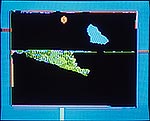
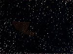
 250M-Sept 3, computer. From sketch and crinoid this day.
9/13
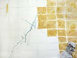
Further along on Outlook. I've decided, as I continue to make the warped-squares "background," to fill in the white gaps. Will be more like the time/space continuum.
Started on another piece, Linkages. (I'm not yet really comfortable with naming a piece so early, just so I can track it through the studio log, but other options elude me.) The origin was to go back to early works, since I'm noticing a great similarity between those around 1970's pieces and what I'm now doing, and see what I could dig up. One of the "Rondo" drawings I did on large filter paper from the chem lab (I knew the filters were rag, not pulp) finally emerged. As I lay it down on the 36 x 48" canvas, the first placements felt wrong. Then I saw a line in the piece and an unstretched canvas. This became the working start. Order (connected line in drawing and outlying rectangle) and the sensual moment (drawing). After I sketched in the positions, I got the idea to flood the canvas in tints of sunset colors and ten "arrange" cellophane to create puddles and shapes. This could be a cool one; "unsolved," exciting elements, just waiting to communicate.
9/16
Jane saw a piece at a recent benefit art auction that she liked; and I told her I'd done something like that, back in my experimenting time, ca. 1967. I got to thinking about influences. My 1962 design class, soon boring me, brought me to do Kline-like city structures and a Dali-inspired woodcut.
But what really struck me as funny was an installation piece I did in 1963. Commissioned to do 30 celebratory table pieces for the monk's refectory at Christmas, I did a magnificent flop. While others had done silkscreened place mats and/or sculptural objects for other high feast days, I decided that since God had chosen to be born simply and poor, it would be arrogant of me to show off artistic skills. So, I while the others were in chapel for Mass, I set out on each table a handful of straw, a powerful and humble statement, I thought, to call each of us to the basics of our vocation. It didn't work at all; most seemed scandalized.
I think I then learned something important about installation art. Unless pumped up by spin and proselytizing, it is more boring to the observer than to the creator.
9/18
Finished Peering. None of the inspirations I put into it turned into the driving force. Usually, the additions, spontaneous doings, compositional changes, changes of heart--all spring from the inspiration, and modify its course. In this piece, all inspirations-- the negative image of a woman, to the rocks, to the bespectacled man---none of them took hold. It was a tiring battle. As I look at it more and more, I think it might have worked out, a belief not so strong as I "finished" it the other three or four times. (See some of the stages.)
There are some new elements, and some old concerns. The "misplaced shadow" of one rock, the scribble in another, the faces not being from my life, and the background--all are newish, and might lead to something. Since the emotion, space, and composition are deep, with color maybe or maybe not so deep, I think "objectively" it is okay.y.
9/23
Well then, I have been snuck up upon by a new direction! The underlayment of the newest painting, Linkages, has become, not the complementary basis, but the driving spirit of the work. As I came into the studio, and looked at the beginnings of that work, including the rondo drawing I'd temporarily attached, I had a visceral reaction and an intellectual realization that work prior for as while had been, not oppressive nor depressive, but "weighty." This work would be about joy. There's now a tilted, Spring-ish horizon in a softened charcoal, partial rectangle. The whole thing is lively. Changing the name--Linkages too heavy. Don't know to what, though.
Then, carrying that realization around, I thought I'd start a new computer piece, focusing on more joyful resources. Although this began with a surfing Hawaiian king and bright colors, it did evolve into a more robust statement. It's only about the history of mankind and of me. It's called Here.
10/14
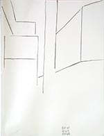
Outlook, acrylic, 36 x 48
At the end, painting in the rest of the rectangles of the time-space continuum, I was just working--no insights or kicks. As I moved around the sunlight I was putting on, however, it clicked into place at a spot that generated a pivot with the figure-windows and the splatter. I liked that a lot; and the piece seemed to come to life as a whole. I also like the sketch of myself, its feeling and technique.
10/15
A total surprise, I had begun this (as Linkages, 9/23) before I finished Outlook (10/14). I began it with what I thought would be a complementary underpainting. But, I liked it so much, that I decided to go with what it was "telling" me. Where Icarus and Outlook were heavy with meaning and paint, Joy was light. I began to see what wanted to go with it. I ended up in a drawer of old drawings, and picked a colored pencil on filter paper (rag) from the 1970's. As I moved it around the painting, in the upper left, it locked in with some of the underpainting. That led to a ghosting with charcoal of a rectangle, then an erasure (part of which I let remain) and a moving to another position. A landscape, tilted suggested itself, both as a compositional device and as another layer of Heraclitus thought. I had to go back to the spontaneous, original underpainting, paint some of it out, and be purposely spontaneous to bring elements of the composition together. I don't know exactly where the suns came from. I think it was an upwelling of bringing the yellows together, Heraclitus, and my love of movement.
Altogether, I enjoyed making this piece very much. It was fun, and it hung together during weeks of scrutiny driven by the thought that it was too "light."
10/26
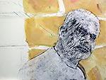
Reworking the Jonas Tumosa portrait.
Started a new piece, inspired by an old computer piece I scanned, Shards. I am interested in the space and concept, not the colors. As I was going to the car, I saw a piece of roofing in the gutter. The shape, its similarity to a shape in the new painting, its relationship to Anselm Kieffer / tar, and the shallowness of so much contemporary work compared to Kieffer--all merged. I went back upstairs to the studio, and did some tearing of the roofing, to make it work with the scale of the rest of the piece. A little "mountain" happened, and I like that popping up from the ground line, much as in Fossil of an End. I may call this piece, a take-off from Kieffer's To The Unknown Painter, "To the Unknown Fugue." Hints at another of Kieffer's works, but, more importantly, at my theme of chaos/cosmos, point/counterpoint.
11/6
Redid Jonas Tumosa as a computer one-off for our family. Changed the perspective, smile, and color relationships, to balance his power and warmth.
The Jasper Johns "Gray" exhibit at the Art Institute of Chicago and late Rothko work inspired me to start Rothko Electric, as an homage and progression of the work of both artists.
Also starting out on a computer piece, Desparate Gates, combining the ideas of impermanence of marks on slate, desire for order, beauty, and who knows what else.
Jonas Tumosa 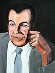
![]() Rothko Electric
Rothko Electric 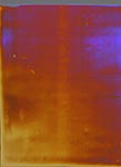
![]() Desparate Grafitti
Desparate Grafitti 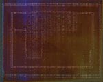
11/19
I think there is a common sensing center in our brains. Aquinas wrote of the "common sense," and I experience it. Lying on the couch, listening to the hum of machinery and the noises outside my window, I "see" the sounds as a textured, moving grayish-yellow-brown rectangle area, overlaid with Motherwell Elegy-like shapes, only less elliptical and deep brown, while pulses of other colors dots through. I "hear" my paintings as symphony-like, and kinesthetically feel the relationships. Seeing Johns does the same thing. In fact, I sense this sense in many artists: Johns, Diebenkorn, Pollock, Judd, Heizer, Mann, Kieffer, Viola. The ones I don't, like Tamayo, Gober and others, seem diminished to me. Some, like Richter, have it, but convey trifling ideas. The Chartres windows have it, too. This sense is the ground of expression, and exists even if the expression is not clear. Who believes in the Blessed Virgin like the Medieval peasants did? Yet, the windows still move us. Those artists that use that sense last longer and mean more. Too bad the postmodernists threw out such "essentialist" ideas. Among artists I know who are not (yet?) in the history books yet have this sense are Kathryn Arnold, Michael Bocok, and Gregg Hertzlieb.
The "Shards-Kieffer" ("To the Unknown Fugue," 10/26) piece has finally taken a direction. The large center field has been washed in dark blue-browns. The outside (a border? accidental strokes? partial border?) will be ochres, warm tones, and some cools. The asphalt-tar will stay, with maybe something accompanying it off to the right.
11/21
There's no better way to ruin a good idea than by putting it into practice. "To the Unknown Fugue" (10/26, 11/19) became quite clunky as I worked on it. Flat. Insipid. Clunky. Even after glazing. Even after I stared at it while eating my food bar. Several fine areas did appear: a rolling, roiling stroke in the main field; some emergent ochre strokes at a border; and a sweeping off-field space on the right. None of those grand things are a path to making this painting work any better.
I'll be working in my sketchbook while in Mexico. Maybe something I do there will be the key to life for the work. Or, maybe some vision will appear as I envision the work. Or maybe I'll give it a good gesso attack.
12/1
While waiting in Dallas-Ft. Worth, looking for inspiration, I was taken by the perspectives of a concourse. However, a study would just a perspective exercise. To see it as a modern "cathedral," or to see it as a contrast of idealism (the vaulted architecture) and the real--both were too common. Then, perhaps being influenced by Varnedoe's Pictures of Nothing and a visit to a gallery that had some decent Bauhaus works, I went abstract. It became fun, as I ran the abstraction chronological gamut from a "hands off," "what you see is what you see," to the more emotional later works. I liked doing the piece, and today, over a week later, I realized how glad I am that I did not fall into that style. It is so easy to project onto it, and to feel elevated while doing it. Yet, Judd, LeWitt and the others who stayed there (unlike Johns) fairly deluded themselves into making something that gives to just a narrow niche of the already narrow niche of those people who are moved by art.
Eyes closed at the pool the other day, I replayed the gentle kiss I had just seen. What started as "can I draw that?" grew into an idea of having the faces float at the bottom of a page, almost off the page. I picked up my sketchbook, and worked out the idea.
I still do not know whether either of these will move into my studio work.
12/12
Back to work on "The Unknown Fugue." Two days ago, stroked into it with white paint, in a way synthesizing Pollock, Tobey, and Stanley. Looked honest and full of energy when I started this morning; but it wasn't deep enough. Tried a flood, mainly ochres with touches of RYB. Looked worse. Rubbed back to a glaze. Still flat and layered-looking. Rubbed away some areas back to white, reglazed with fast brush strokes. Better. Entered some subtle colors. Okay. Overall, though, seven layers into the piece, it still isn't right esthetically or expressively. Seven more? Will it start coming together soon?
12/14
"The Unknown Fugue" first came together in my mind last night. I got the idea to go over the piece with black paint, synthesizing not only Pollock, Tobey, and Stanley, as I had with the white paint, but adding a bit of Kline. It looked good; I liked the "erasure" by repeating, a kind of anti-matter, a kind of zen.
Doing it with real paint this morning worked -- even better! Although it took me ten minutes or so to mix the right black , and although I had to go back and re-stroke several times, it felt good and it looked good. At some point, the paint brought to mind a lost painting of mine from about 1965, called "Gomorrah in the Setting Sun." That painting, too, had dark strokes of thick paint, and, although painted with just regular black oil, with a trite-ish theme, and of awkward composition -- I liked that piece. It was 4-5 feet wide, and I left it in Cincinnati when I left the monks.
So, for several reasons, the piece pleases me. My original idea of lightening the upper right as though illuminated through a haze doesn't work, so the current extreme unbalance (with the tattered tar shingle on the left) will be a fine challenge when I get back to the studio.
![]() Gomorrah in the Setting Sun, oil on homosil board, ca. 48 x 48 in.
Gomorrah in the Setting Sun, oil on homosil board, ca. 48 x 48 in.
12/17
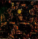
Intensified the darks, bringing out the tar shape in "The Unknown Fugue"
![]() The Unknown Fugue, acrylic and tar on canvas, 36 x 48 in.
The Unknown Fugue, acrylic and tar on canvas, 36 x 48 in.
12/30
Been scanning in old slides, shooting new digitals, and trying to get the catalog of my works organized. This has led to some reviewing. Even as a young, callow artist, I was interested in the connection of things, horizons/doorways/borders/boundaries, and lonely. Hasn't changed much, just a bit more of the wisdom of non-grasping emptiness.
![]() Greensun, 1966
Greensun, 1966  Solitaire, 1973
 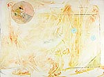 Joy, 2007
12/31
The cataloging of works continues. As a fallow field, The Unknown Fugue awaits. All the present moments and past paintings will be attended to. Going with the wisdom of non-grasping emptiness.
![]()
![]()
![]()
![]()
![]() Previous
Previous ![]() Top
Top ![]() Next
Next
Click on images below to ENLARGE
acrylic, oil, and collage on canvas, 36 x 48 in.
acrylic in progress 36 x 48 in.
pencil on paper, 14 x 14 in.
computer, 15 x 11 in.
computer, 15 x 12 in.
acrylic & charcoal 36 x 48 in.
acrylic & colored pencil 36 x 48